mossfield origins - dev #11
QOL pass #1
QOL pass #1
Quality of life
Minor update today, my partner play tested a little, since the game has been changing fast, they hadn't played in a while.
There were several immediately obvious issues that are quick to resolve, so that's what I did with the small amount of time I had today.
For example, the waste icon no longer disappears randomly. This was caused by the ui layout being too narrow for all the icons I added, pushing the waste icon outside the container, sometimes enough that it wouldn't render. The space is wider now as intended.

The camera
The camera was bound to left mouse, and when dragging, behaved like a first person fly camera, which is handy for development, but kinda super inconvenient for actually playing.
I switched to a simple wasd based top down style camera which improves this aspect, since you don't need mouse input and it doesn't interfere or cause rogue clicks on the hud. This was made worse by the mouse being captured and centered in screen, causing weird snapping and sometimes releasing a mouse click on a random element. I have a toggle for fly camera usually, I'll just add that back.
The hud and rogue clicks
I made the ui ignore the mouse a lot more enthusiastically, basically by ignoring the mouse at the container level and not at the individual element. Before, e.g the build button when hovered would mark the mouse as busy, so the game doesn't receive the click. This was too precise and lead to often clicking in the world when not intending to.
The second issue is the reverse, you'd click in the world and the mouse would release on the hud, triggering something unintentional. This was worst with the building upgrades, selecting a building normally, if the upgrade you happened to be hovering over was available, would be triggered by the release of the mouse. It was real painful but ok in rapid development, no good while playing.
The upgrades menu
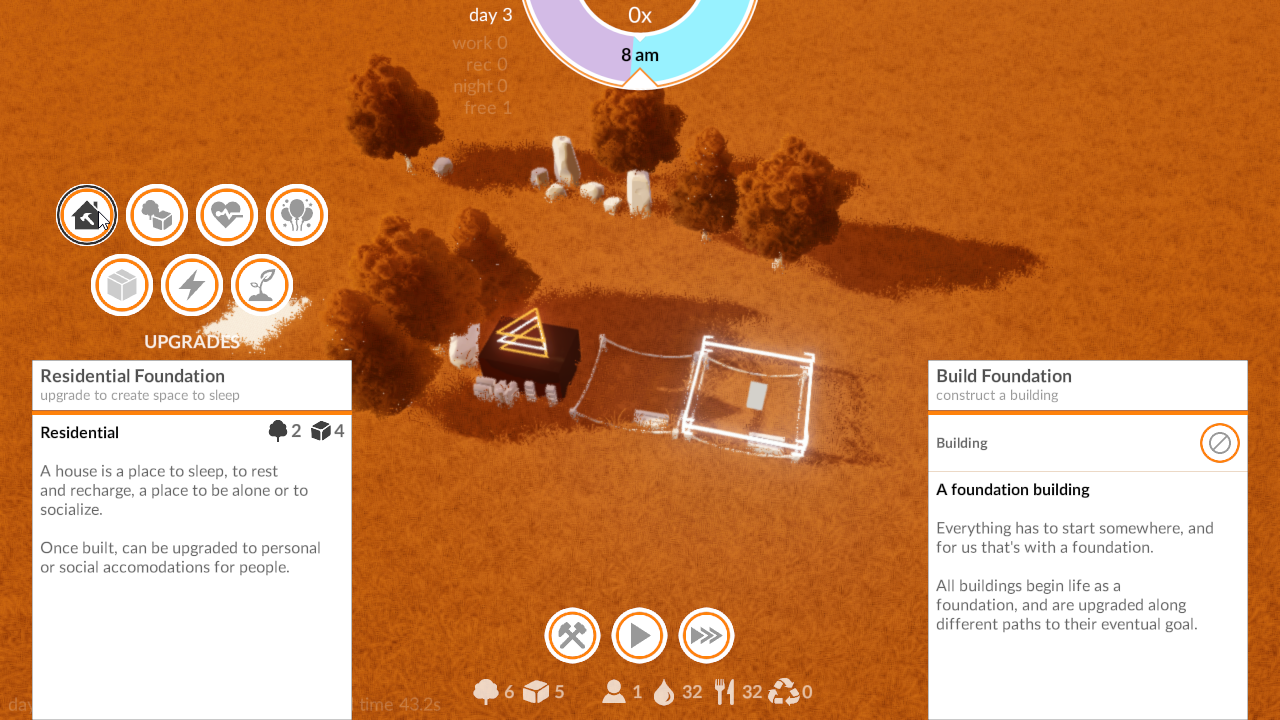
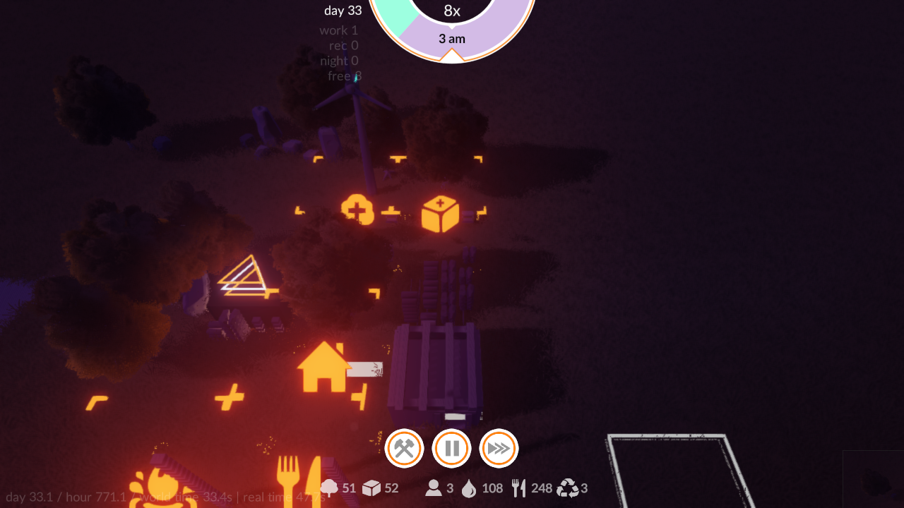
Which leads to the upgrades menu. It's placement was taking up a lot of space on the area you interact with the world. Even if the mouse clicking was more resilient or whatever, it doesn't make sense to have to narrow the camera area you can interact with to such a small space. Instead, I moved the upgrades out to the left sidebar instead for now, which is an improvement over what was there, even if not final.
I also found a bug in the animation on the hover info screen, which may or may not have been present before that, but is now animating correctly again.
The results
The video just shows all that combined, nothing too exciting, but definitely plays better.
The grid
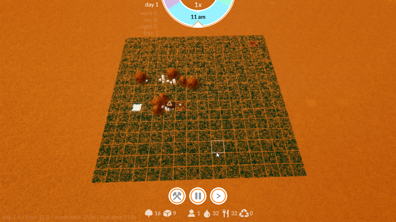
Previously the building space actually started exactly on the line where your research center (start building) was. This is easier to show in image form:
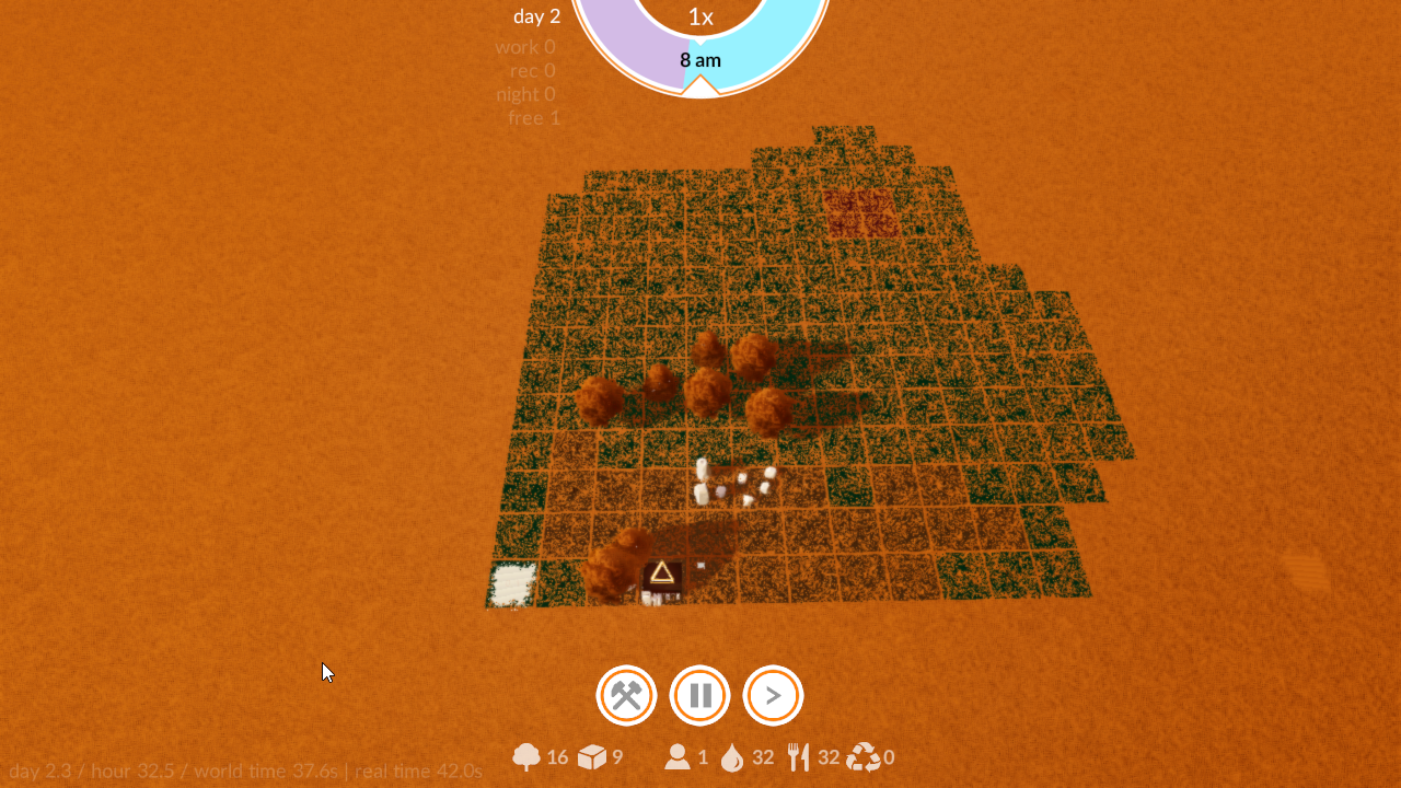
The game operates on a normal 2D tilemap and stores data in the tiles (like which building is there, or sometimes for transferring information to the next upgrade etc).
The problem is the game doesn't technically allow you to build outside that space, which was arbitrarily limiting. And due to the mouse weirdness above, often mean the build icon didn't visibly change anything... cos the cursor is hidden when on an invalid (non existent) tile. So a tester clicks the build button, and nothing changes... did it work?
I say technically above, because the game did actually allow you to build out there due to a bug. It wouldn't let you select out there, so you couldn't cancel a construction, so if you had the build cursor active, and clicked on the resource icons to get free resources... you'd end up wasting days waiting on an invalid construction out of bounds. That's fixed now too.
The fix
The obvious solution is to move the start point inward, and expand the grid to the intended size for now. This works well and isn't as unintuitive. I'll still improve the ux for that later, but for now that solves a few problems.
next...
After testing today the biggest issue is balance and resources for the starting game. You barely start with enough to make a house, and not enough to make resource buildings to generate more. You have to cheat them in to play. Again, fine for testing, bad for actual playing.
I've gone over the amounts and reasoned a bit about it, and the goal was always that you'd have several options to build, so you can decide your play style up front. This will be corrected soon, but I also think there's a lack of pressure to actually manage your spending and what not, so I'm gonna prototype another resource that other buildings will consume.
I'll still push on all the assets as I can in between.

